RTW INVESTMENTS REBRAND
RTW is a New York-based life sciences investment and innovation firm dedicated to solving the most challenging, unmet patient needs not only through the investments they make but also their own scientific research
As the company grew and evolved, there was a need to craft a refreshed brand identity to support the business' future aspirations.
My role was to define the motion system for the new brand while also editing multiple films for its launch and support web designs with animated assets.

GOLD for Best Digital Rebrand
SILVER for Best Use of Digital from the Healthcare and Pharmaceutical Sector

KEY CHARACTERISTICS
DIRECTION
Know where they’re going,
confident, clarity of thinking,
moving in their own direction
INSIGHT
Seeing things others
miss. Informed and
deep understanding
UNEXPECTED
Challenging the consensus.
Thinking differently.
Entrepreneurial.
Unique perspective.
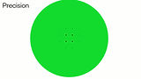
PRECISE
Select opportunities with
pinpoint precision, expert,
meticulous, rigorous.
MOTION SYSTEM
CORE BEHAVIOUR
A central, precise starting point that expands further and further. Representing RTW's purpose at the core of their communications.

GRAPHIC LANGUAGE

RIGOUR
The grid grows linearly and represents direction and the business' strong foundation.
It is the platform for every graphic composition.
FOCUS
The circle represents RTW's deep knowledge in the science that they invest in.
HUMAN
The shapes interact and blend into each other organically in contrast with the rigidity and rigour of the grid.
ROBUST
The square represents strength and exprertise. Combined and contrasting with the human element.


These key characteristics are fundamental to the motion system – they inform all the transitions, typography behaviour and graphics animations.


BRONZE for Best Use of Video from the Healthcare and Pharmaceutical Sector


PURPOSE FILM
BRONZE for Best Use of Video from the Healthcare and Pharmaceutical Sector
To showcase RTW’s purpose, Our Power of Conviction, and its four key attributes – Direction, Insight, Unexpected, and Precise – I created a short film capturing these elements. I handled the entire project, from footage selection and storyboarding to editing, music choice and color grading.
GOLD for best Copy Style or Tone of Voice


CULTURE FILM
GOLD for best Copy Style or Tone of Voice
RTW is a team of smart, humble, and collaborative thinkers. Their deep research and unique approach needed to shine through in the film while maintaining the company’s playful and humble spirit.
I was responsible for briefing videographers on art direction for the New York interview shoot, selecting footage, and editing the film to feel like a cohesive narrative rather than a Q&A.

Combining icons and illustrations with motion to communicate the RTW story in an engaging way for users.


